The Portrait Before the Beauty Advertisement
Portrait conventions before beauty advertising reveal how pose, framing, and audience shaped appearance, giving you a clearer way to read portraits today.
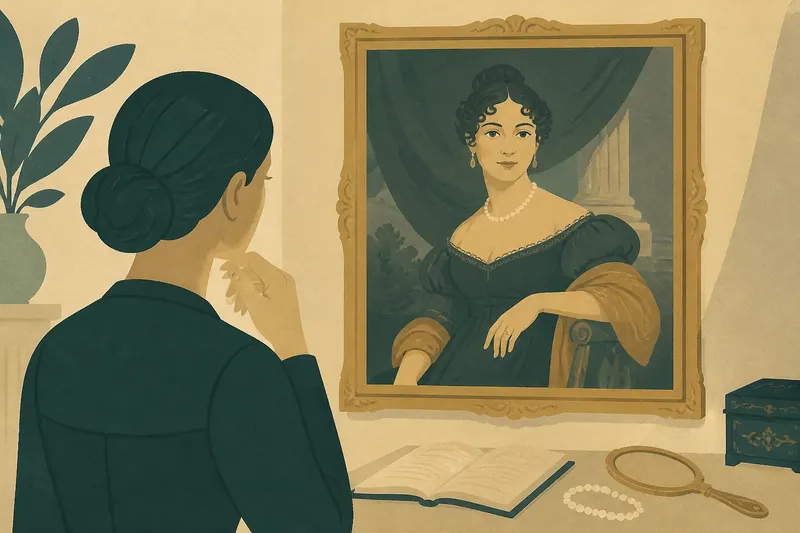
The most common mistake in reading an old portrait is treating its pose as a candid record of how someone naturally looked. That shortcut can cost you the image’s purpose: portraits arranged appearance for particular viewers, using posture, clothing, gesture, and setting to make a sitter legible. Portrait conventions before beauty advertising offer a way to see those choices without assuming every polished image was selling a product.
A family likeness, a small portrait kept close, and a formal image displayed in a public room may all flatter their sitters, but they invite different kinds of attention. Ask not only “What does this person look like?” but also “What relationship does the image propose between this person and me?”
Portrait conventions before beauty advertising addressed particular viewers
Portraiture shaped ideas of appearance long before beauty advertising became a recognizable commercial form. In many settings, portraits presented qualities such as authority, modesty, refinement, learning, or social belonging. Those meanings came from conventions shared by artists and viewers, though their details varied with period, place, and purpose.
As print and commercial culture developed, advertisements increasingly used images to connect appearance with a product, service, or promised result. This was not a single clean break: portraiture continued, and its conventions could overlap with commercial imagery. The useful distinction is one of emphasis. A portrait often arranged appearance around identity or relationships; an advertisement commonly asked viewers to connect an image with a purchase.
Look first at the sitter’s gaze. Eyes turned toward the viewer can create acknowledgment, confidence, or a feeling of access; averted eyes may suggest privacy, contemplation, or decorum. None of these meanings is fixed, so consider the expression, clothing, setting, and scale alongside the gaze.
Then ask who might have seen the portrait. A likeness displayed in a ceremonial or public setting may emphasize rank and composure, while a small image made for close viewing can reward attention to a face, hand, or personal token. These are clues, not proof of where the portrait traveled or how it was used.
Say you are comparing two portraits of people in similar formal clothing. One faces forward, meets your gaze, and fills most of the frame; the other turns toward a table and looks down at an open book. You might read the first as emphasizing presence and the second as inviting attention to learning, but you would check each interpretation against the rest of the image.
Pose makes social qualities visible
When a portrait feels commanding, inspect the body before settling on the facial expression. A straight torso, level head, and firm stance can suggest composure. A seated figure may seem equally authoritative through a stable chair, a measured hand gesture, or a gaze that holds its ground.
For an image that seems to favor gentleness or reserve, look for a softer turn of the head, relaxed shoulders, and hands placed without obvious strain. Such choices can make a sitter seem approachable while preserving formality. They are crafted impressions, not neutral records of personality.
Objects can make a sitter’s role visible. A book, writing surface, instrument, or tool may support an impression of learning or professional skill. Ask whether the sitter appears to use the object, present it, or merely stand beside it; that difference can shift the image from an impression of active competence toward a more symbolic claim.
For a reading of beauty ideals, describe how posture shapes the body’s presence. A controlled stance might suggest discipline, while a turned profile might draw attention to the line of the face or clothing. Describing these choices is more useful than judging the sitter against a modern standard.
Framing directs attention through the portrait
Framing includes more than the border. It also means how much of the body is visible, where the figure sits, and what occupies the surrounding space. A close view concentrates attention on the face, hair, and dress; a broader view gives posture and setting more room to contribute.
Compare the prominence of the face with that of clothing and objects. A face may anchor the image even when elaborate fabric or jewelry draws the eye. A column, curtain, landscape, or patterned interior can connect the sitter with ideas such as wealth, taste, nature, or civic life. The setting helps shape the portrait’s meaning rather than simply filling empty space.
Notice the edges. Cropping can make a figure feel close, while ample space around a sitter can create distance or grandeur. A hand partly hidden by the frame or resting on a chair may still matter: small gestures can give visible form to larger qualities.
At a museum or while studying a reproduction, describe the image in this order: distance from the sitter, direction of the body, placement of the hands, gaze, and surrounding objects. This keeps interpretation tied to what you can see and makes comparisons more precise than saying one portrait simply feels more beautiful.
Adornment signals what an audience may recognize
Fine fabric, carefully arranged hair, jewelry, and decorative objects can signal wealth, taste, family connection, occupation, or ceremonial importance. Avoid treating any item as a symbol with one universal meaning. Instead, ask why the detail is visible here and how it supports the sitter’s presentation.
The intended viewing distance can change the effect of ornament. A portrait made for close inspection may reward attention to small accessories and textures. An image meant to be seen from farther away may depend more on the overall silhouette, color, and posture. The same kind of adornment can therefore work as an intimate detail in one image and a public sign in another.
Not worth the effort: assigning a fixed symbolic meaning to every fold of fabric, color, or accessory before considering the whole composition. Some details remain ambiguous, and a careful reading can acknowledge that without forcing a solution.
What questions help distinguish portrait choices?
Does a direct gaze always mean confidence?
No. A direct gaze can suggest confidence, intimacy, formality, or a claim to be seen, depending on the sitter’s expression and the rest of the composition. Describe the gaze first, then consider which reading fits the surrounding evidence.
Why do some portraits show only the head and shoulders?
A close frame concentrates attention on the face, hair, and clothing near the neckline. It may also suit an image intended for personal viewing, though the crop alone cannot establish the portrait’s original audience or use.
How can I tell whether an object is symbolic or simply decorative?
Check its placement, scale, and relationship to the sitter’s hands or gaze. If several details draw attention to the same object, then it may support the portrait’s message; if not, treat its role as uncertain rather than assigning it a definite meaning.
Is it useful to compare a portrait with a beauty advertisement?
Yes, if you compare how each image addresses its viewer. A portrait may negotiate status, identity, or social belonging, while an advertisement commonly links appearance to a product or purchase. Treating them as identical can obscure what each image asks the viewer to do.
Use visible evidence to build a careful reading
If you are standing in front of a portrait with little time, start with gaze and posture. They are quick to observe and can suggest whether the image feels direct, reserved, or authoritative. Save fine details for a second look rather than rushing to assign a complete story.
If you are writing about an image, separate observation from interpretation. “The sitter turns toward a table and rests one hand beside a book” describes what is visible; “the sitter is modest and scholarly” is an interpretation that needs support. This distinction makes your account clearer and leaves room for alternatives.
If you are choosing an image for a discussion about beauty, look for visible choices in pose, framing, dress, and setting, not just an idealized face. A portrait with a legible social role can prompt richer questions about how appearance is organized.
If you are comparing portraits, hold one feature constant at a time. Compare gaze across several images, then framing, then hands or setting. This makes differences easier to see without pretending that portraits from different circumstances share one standard of beauty.
Let audience and purpose guide the reading
A useful reading joins three questions: how the sitter is posed, how the image frames the body, and who seems meant to look. Together, these choices show how portraits made appearance persuasive, while commercial images increasingly connected visual appeal with goods or services in particular historical contexts.
When you return to portrait conventions before beauty advertising, ask what the image lets the sitter claim, what it asks the viewer to notice, and what kind of distance it keeps between them. Beauty then becomes something shaped by craft, convention, and audience, not merely a quality located in a face.