Why a Colour Palette Can Feel Like a Point of View
A colour palette can feel like a point of view: learn how hue, contrast, and repetition direct attention and shape a visual mood without fixed meanings.
The most common mistake with a colour palette is choosing each shade as if it had to speak for itself. The result can look tidy but directionless: the eye has no clear place to land, and the mood shifts from one area to the next. A palette feels like a point of view when its colours work together to guide attention, not when they carry supposedly universal meanings.
That distinction matters in beauty images, clothing, makeup, and the art we keep around us. A dark lipstick, a pale background, or a bright scarf can suggest very different things depending on what sits beside it, how strongly it contrasts, and whether it appears once or again and again.
A palette directs the eye before it tells a story
Hue is the family a color belongs to, such as red, blue, or green. But hue alone rarely determines what catches attention. A small, vivid patch against a quiet field may draw the eye more strongly than a larger area in a similar shade to its surroundings.
Contrast is the difference between neighboring colors. It can come from light and dark, muted and vivid, or warm and cool. Strong contrast makes an edge or object easier to notice; softer contrast lets forms blend and can make a composition feel quieter. Neither effect is automatically better. The useful question is what the image wants the viewer to notice first.
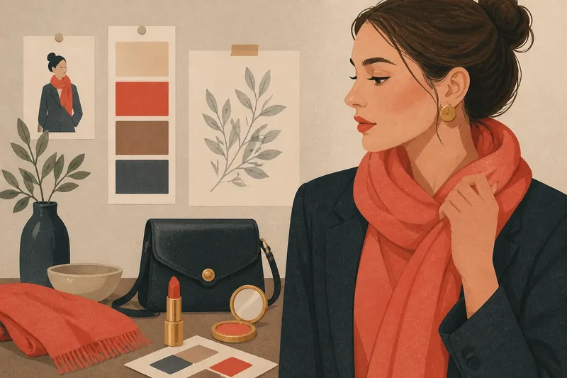
Imagine you are assembling a portrait look with a charcoal jacket, a soft beige wall, and a bright coral scarf. If the scarf is the only vivid element, attention is likely to move toward the face and neck area, especially if the scarf sits close to the face. Add coral lipstick or a coral detail elsewhere, and the eye may travel between those echoes instead. The colors have not changed their inherent meaning; their placement and repetition have changed the viewing path.
Color relationships make a mood more specific
People often describe a palette as warm, cool, soft, sharp, or restrained. These words can be useful shorthand, but they describe relationships rather than fixed emotional rules. A blue can feel gentle beside a crisp white, or forceful beside a muted gray. A red can seem playful in a small accent or dominant when it fills most of the frame.
To make a mood legible, consider three choices together: how bright the colors are, how different they are from one another, and how much space each occupies. A pale, low-contrast palette may feel airy in one composition, while the same colors can seem washed out if the forms lack definition. A saturated palette can feel lively, but crowded if every element competes at full volume.
For makeup, this means a lipstick shade cannot be assessed apart from skin, clothing, lighting, and the rest of the face. A berry lip against a simple outfit may become the focal point; paired with equally vivid eye makeup and patterned clothing, it shares attention. The result depends on the whole arrangement, not a color label such as “bold” or “romantic.”
Repetition turns separate colors into a visual voice
When a hue appears more than once, the viewer begins to connect those appearances. A small repeat can make a palette feel intentional: a warm brown in an eyebrow, a jacket button, and the background may link the face to its setting without demanding attention. Repetition can also create rhythm, giving the eye a sequence to follow.
Too much repetition can flatten that rhythm. If every accent has the same size, brightness, and spacing, the eye may stop distinguishing one from another. A useful arrangement often varies the role of a repeated shade: one appearance can be prominent, another quiet, and a third barely noticeable.
Try this with a digital collage or a printed outfit sketch. Choose one accent color, place it in a focal detail, then repeat it in a smaller area away from that focal point. Step back and notice whether your eye moves between the two. If it does, the repeat is linking parts of the image; if everything pulls equally, reduce the intensity or prominence of one accent.
What should you ask when choosing a palette?
Which part should the viewer notice first?
Choose the focal area before adding decorative color. Use contrast or a concentrated accent there, then keep nearby colors quieter if you want that feature to remain prominent.
How can a palette feel calm without becoming flat?
Keep neighboring colors close in intensity, but preserve some difference in lightness, texture, or shape. A subtle change in finish—matte fabric beside a glossy accessory, for instance—can provide definition without introducing another loud hue.
Does a color have the same meaning for everyone?
No. Associations are shaped by personal memory, cultural context, setting, and the colors around the shade in question. Describe what the palette visibly does—where it creates contrast or repetition—before assigning it an emotional interpretation.
How can I tell if an accent color is doing too much?
Look away briefly, then return your gaze to the image and notice where it lands first. If the accent repeatedly pulls attention from the intended subject, try making it smaller, duller, or less isolated.
Test the palette in the setting where it will be seen
Colors shift with their surroundings. Daylight, warm indoor bulbs, a phone screen, and the colors of nearby clothing can all change how a shade appears. A palette intended for a portrait, for example, may read differently on a screen with a bright white background than it does in a softly lit room.
Check the actual materials or image under the conditions that matter: place clothing together rather than judging each item alone, or view a makeup combination beside the outfit it is meant to accompany. For digital work, look at the image at its intended size and against its likely background. These simple checks reveal whether a contrast still reads clearly or a repeated accent disappears.
What is not worth the effort is trying to find a single emotional dictionary for every hue. A list that says one color always means confidence or another always means calm cannot account for placement, culture, or the viewer’s own associations. It is more useful to observe how a particular arrangement directs the eye and what kind of visual emphasis it creates.
A point of view emerges from choices, not color codes
A colour palette can feel like a point of view because it makes selective decisions: this area stands out, that detail echoes it, and another part stays quiet. Hue supplies the material, contrast sets the emphasis, and repetition connects the parts. The viewer experiences those choices before deciding what they mean.
When a palette feels uncertain, adjust one relationship at a time. Reduce a competing accent, strengthen a focal contrast, or repeat a color where you want the eye to return. Then look again in context. That process keeps the image’s character open to interpretation while making its visual direction clear.